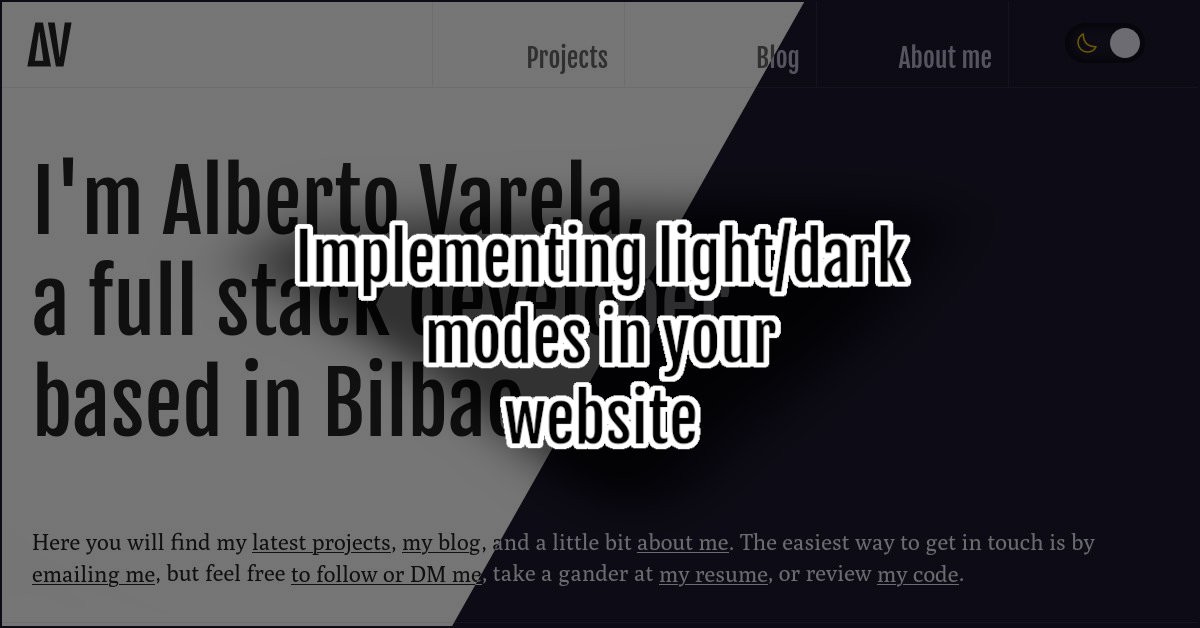
I've recently rebranded and redesigned the look and feel of my website. As a part of that redesign, I've implemented both a light and a dark theme that will automatically be selected based on the user's preferences; it also includes a toggle switch that will allow the user to change that preference for this website. In this post, I will show you how I did it.
Nowadays, the ability to switch between a light or a dark theme has become extremely popular on the internet. It has been a while since we began to see it on desktop applications, but now, we can also see it every day on most websites we use: Github, Stackoverflow, Twitter, etc. There are multiple ways to implement it, I’ll show you mine.
Writing the themes
It’s 2022, we survived the Coronavirus, and Internet Explorer is finally dead. I think it’s a good time to start using CSS custom properties if you haven’t already (you can read this fantastic post from Chris Coyier if you are not familiar with them or if you don’t know what I’m talking about).
Even though I’ve started talking about two themes, I’m obviously talking about having a single CSS code with two variants. The key to creating those variants is to write every single color that appears on your theme in a custom property. In my case, I’ve started defining all the colors used in the light theme, which is the default I’ve chosen for the situation when we don’t know the user preference:
body {
  --bg-color: #fff;
  --bg-color-secondary: #eee;
  --text-color: #303030;
  --text-color-secondary: #707070;
  --border-color: #eeeeee;
}
Once we have the values for the light variant, we need to define the same properties for the dark one, and we will add them inside a media query.
@media (prefers-color-scheme: dark) {
  body {
    --bg-color: #292639;
    --bg-color-secondary: #1b1928;
    --text-color: #ebeaf7;
    --text-color-secondary: #bebbd2;
    --border-color: #3a3650;
  }
}
Now, we can just use those properties in our CSS.
body {
  background: var(--bg-color);
  color: var(--text-color);
  /* ... */
}

.header {
  border-bottom: 1px solid var(--border-color);
  /* ... */
}

.menu-item {
  color: var(--text-color-secondary);
  /* ... */
}

.button {
  background: var(--bg-color-secondary);
  border: 1px solid var(--border-color);
  /* ... */
}

/* ... */
Some UX considerations
Don’t get me wrong; I’m not a UX designer. Anyway, I feel comfortable enough to give you some tips regarding UX on light/dark themes:
Dark is not black. There are lots of dark colors apart from the #000000, in fact, you can see that I’m not using black as a background color in this site. Light is not necessarily white either. There are a lot of places to get inspiration from; if you are not an expert in color theory either, review what other sites do or take some ideas from IDE themes.
There is no need to switch every color. I could be wrong, but shadows are always dark. Take into consideration where the colors are being used. You can use a different kind of shadow for each variant, maybe you will need them to be more intense (or with less transparency) in the dark theme, but they should be dark.
Base the color of the SVG icons on the content. Ensure that you don’t hardcode color codes in the stroke or the fill properties of your SVG icons. Use currentColor in those properties and let the CSS cascade do its job.
Keep an eye on content images. Not every single picture will play well with both themes. Test the images you choose for your content and select those that look fine with dark and light backgrounds. Sometimes that could be impossible, don’t worry, there are different ways to show multiple images to your users, for example:
<picture>
  <source srcset="image-dark.png" media="(prefers-color-scheme: dark)" />
  <source srcset="image-light.png" media="(prefers-color-scheme: light)" />
  <img src="image-light.png" />
</picture>
Another option, which is the one I’ve chosen, is to apply a filter to the pictures in the dark mode, making them darker and with a higher contrast:
@media (prefers-color-scheme: dark) {
  img {
    filter: brightness(0.9) contrast(1.1);
  }
}
If you follow these steps, you will now have two versions of your theme. I know it is not always as simple as I described here, particularly if you are not creating your theme from scratch but adding a new variant to the existing one. Adapt this tips to your situation, and don’t give up.
Letting the user switch
At this point, we have assumed the user will always want to see your website with the color mode preference that we read in the prefers-color-scheme media feature. That’s a big assumption. In my opinion, it’s a good starting point, but we will always let the user switch from light to dark or vice-versa.
The most common way to do it is to create a fancy switch, but any kind of button will do the job also. This article aims to show you how you can implement the functionality, and we won’t focus on the design of the switch. Anyway, you can search here for inspiration or take a look at the code of my own switch on this Codepen:
See the Pen Light/Dark theme switch by Alberto Varela (@artberri) on CodePen.
Once we have designed our switch or button, what we should do is implement the functionality with javascript. We will be able to do it with this simple code:
// Get the button element
const btn = document.querySelector(".your-button-or-switch-class");
// Detect if user preference is dark
const prefersDarkScheme = window.matchMedia("(prefers-color-scheme: dark)");
// On button click
btn.addEventListener("click", function() {
  // Get users preference
  const userSystemPreference = prefersDarkScheme.matches ? "dark" : "light";
  // Choose the class that will be added or removed
  const toggleClass = userSystemPreference === "dark" ? "light" : "dark";
  // Add or remove the class on the <html> element
  document.documentElement.classList.toggle(toggleClass);
});
As you can see, we will add or remove the dark class to the html element if the user prefers the light theme, and we will toggle the light class in case their preferred option is dark. This won’t trigger any effect for now, but it will with this simple addition to our CSS:
.dark body {
  --bg-color: #292639;
  --bg-color-secondary: #1b1928;
  --text-color: #ebeaf7;
  --text-color-secondary: #bebbd2;
  --border-color: #3a3650;
}

@media (prefers-color-scheme: dark) {
  .light body {
    --bg-color: #fff;
    --bg-color-secondary: #eee;
    --text-color: #303030;
    --text-color-secondary: #707070;
    --border-color: #eeeeee;
  }
}
With all this, our website will be loaded with the preferred theme of the user, and it will allow them to switch if they want. So, are we done here? Not yet.
Storing user’s preference
There is only one thing we lack; we need to store the user’s preferences to keep them between sessions or page navigation. I think the easiest way is to save it in browser’s local storage and to do so, we need to modify the Javascript code I’d shown you previously.
const btn = document.querySelector(".your-button-or-switch-class");
const prefersDarkScheme = window.matchMedia("(prefers-color-scheme: dark)");
btn.addEventListener("click", function() {
  const userSystemPreference = prefersDarkScheme.matches ? "dark" : "light";
  const toggleClass = userSystemPreference === "dark" ? "light" : "dark";
  document.documentElement.classList.toggle(toggleClass);

  // Obtain which is the user's current preference for our website
  const userCurrentPreference = document.documentElement.classList.contains(toggleClass)
    ? toggleClass
    : userSystemPreference;
  // Save it in local storage
  localStorage.setItem("mode", mode);
});
This little modification will get the current mode based on the class of the html document (or its absence) and save it on local storage. Once the setting is saved, we need to ensure that we use it on every page load, and we will do that by executing this code in the <head> of our webpage before loading any CSS:
<script type="text/javascript">
  (function () {
      var userCurrentPreference = localStorage.getItem("mode");
      if (userCurrentPreference === "dark") document.documentElement.classList.toggle("dark");
      else if (userCurrentPreference === "light") document.documentElement.classList.toggle("light");
  })();
</script>
Wondering why I’m asking you to add some synchronous Javascript code directly in the head of your HTML? By adding this snippet asynchronously, or after the HTML and the CSS is loaded, you will run the risk of having a flash of incorrect theme color (this means that the wrong theme could be shown during some milliseconds). The overload of this code is worth in my opinion. Some people use a cookie-based solution to avoid this code, but it needs to be implemented server-side, which is not a possibility if you have a static generated site like me.
I hope you enjoy reading; don’t forget to share it on your preferred social network if you do so. You can also give me your thoughts about the whole site redesign and rebranding.
This text is licensed under a Creative Commons Attribution 4.0 International License.